
Deploy, configure, troubleshoot & secure containers in minutes on Kubernetes, Docker, and Swarm in anydata center, cloud, network edge or IIOT device.
Disciplines
UI Design
UX Design
Front End Development
Website Design
Asset Creation
Deliverables
Figma UI Library
Product/UX Design
UI Mockups
High fidelity prototypes
Website Designs
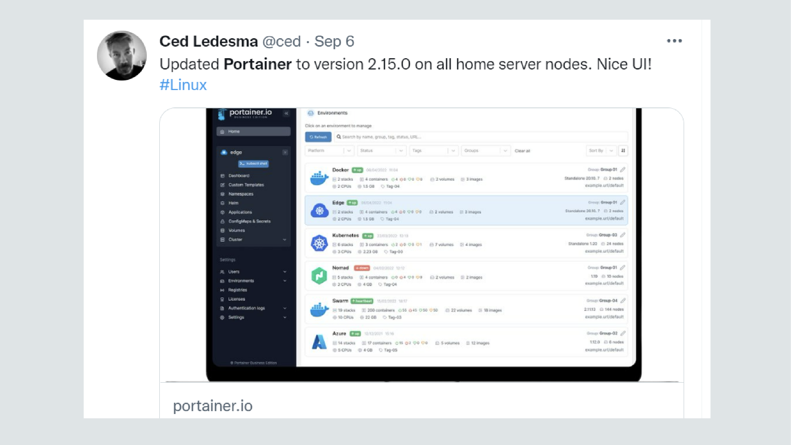
Portainer provides a GUI that reduces the complexity of market disrupting containerisation tools such as Docker, Kubernetes and Swarm, allowing more novice users to safely utilise the full power of these technologies, but without the steep learning curve. This allows businesses to adopt containerisation both faster and in a more cost effective manner, which is why Portainer's customers includes the likes of Apple, Microsoft, IBM and VW, and many others.
UI Overhaul
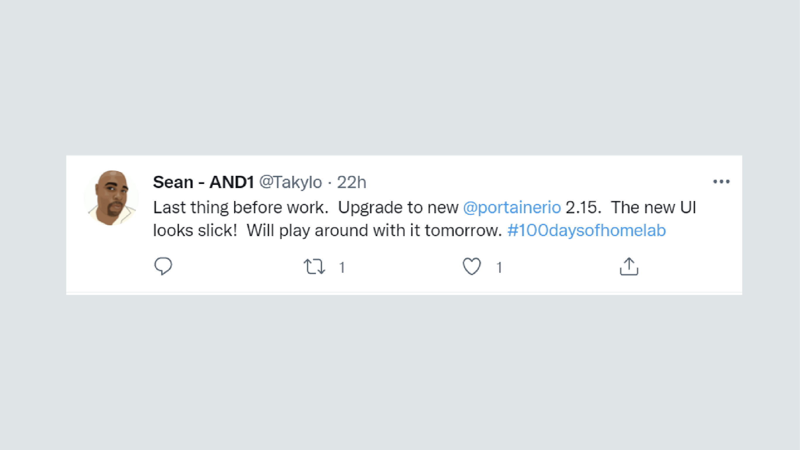
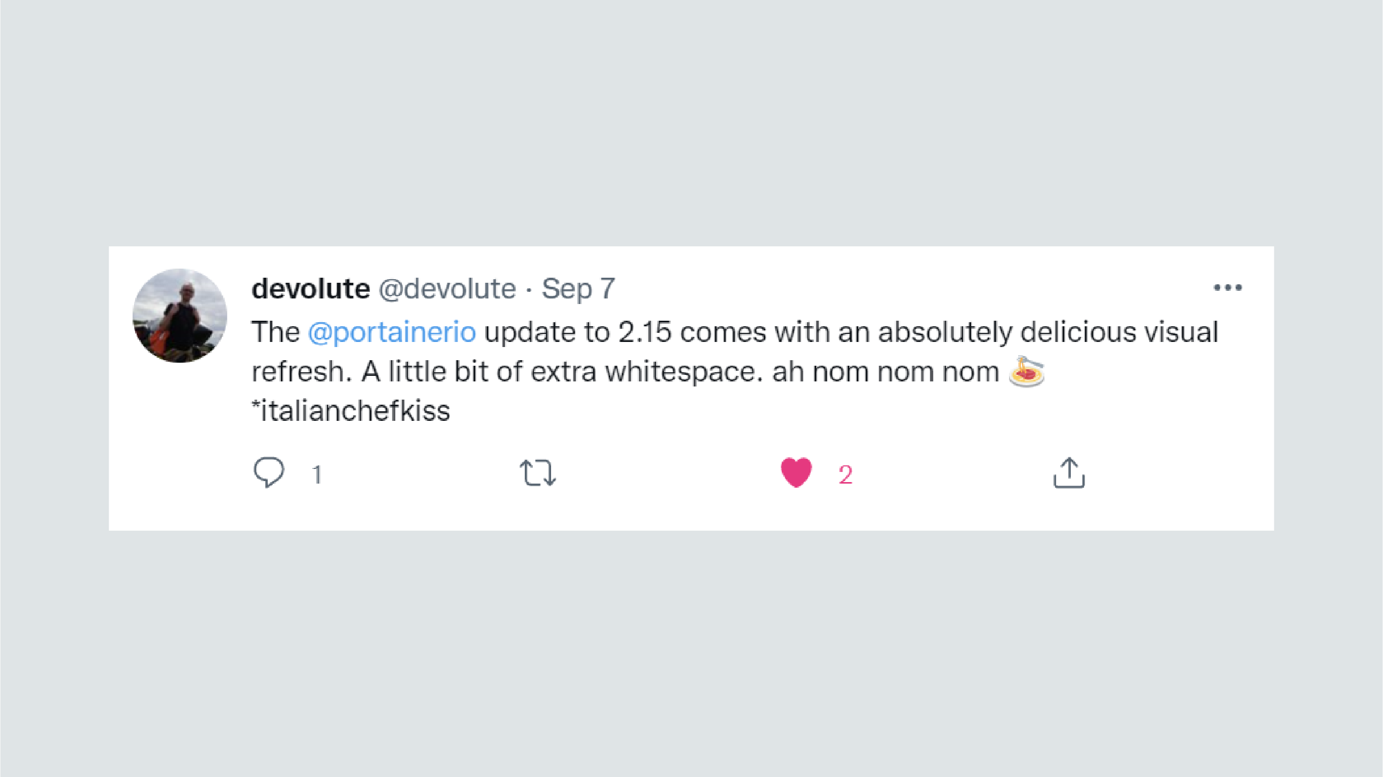
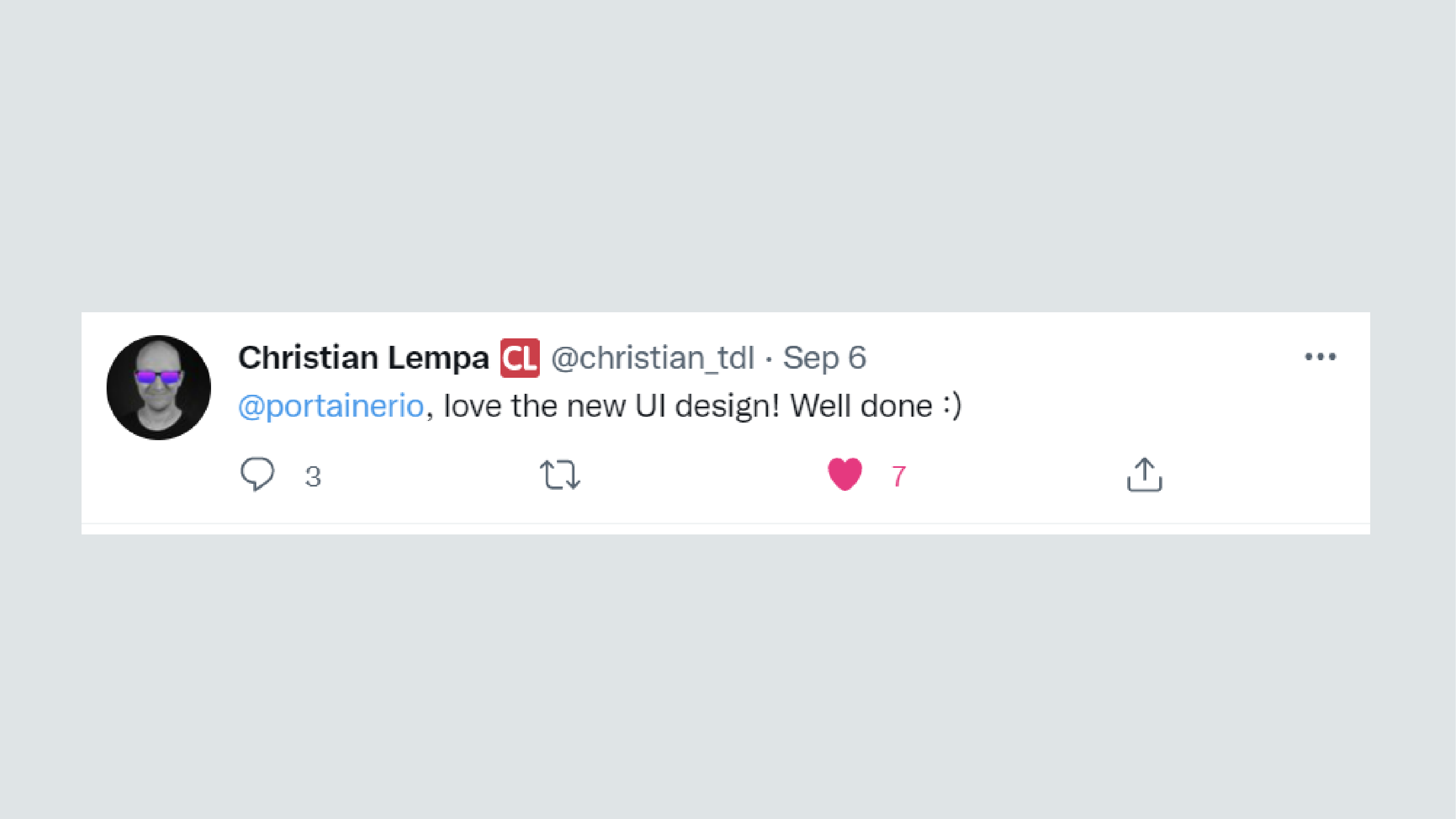
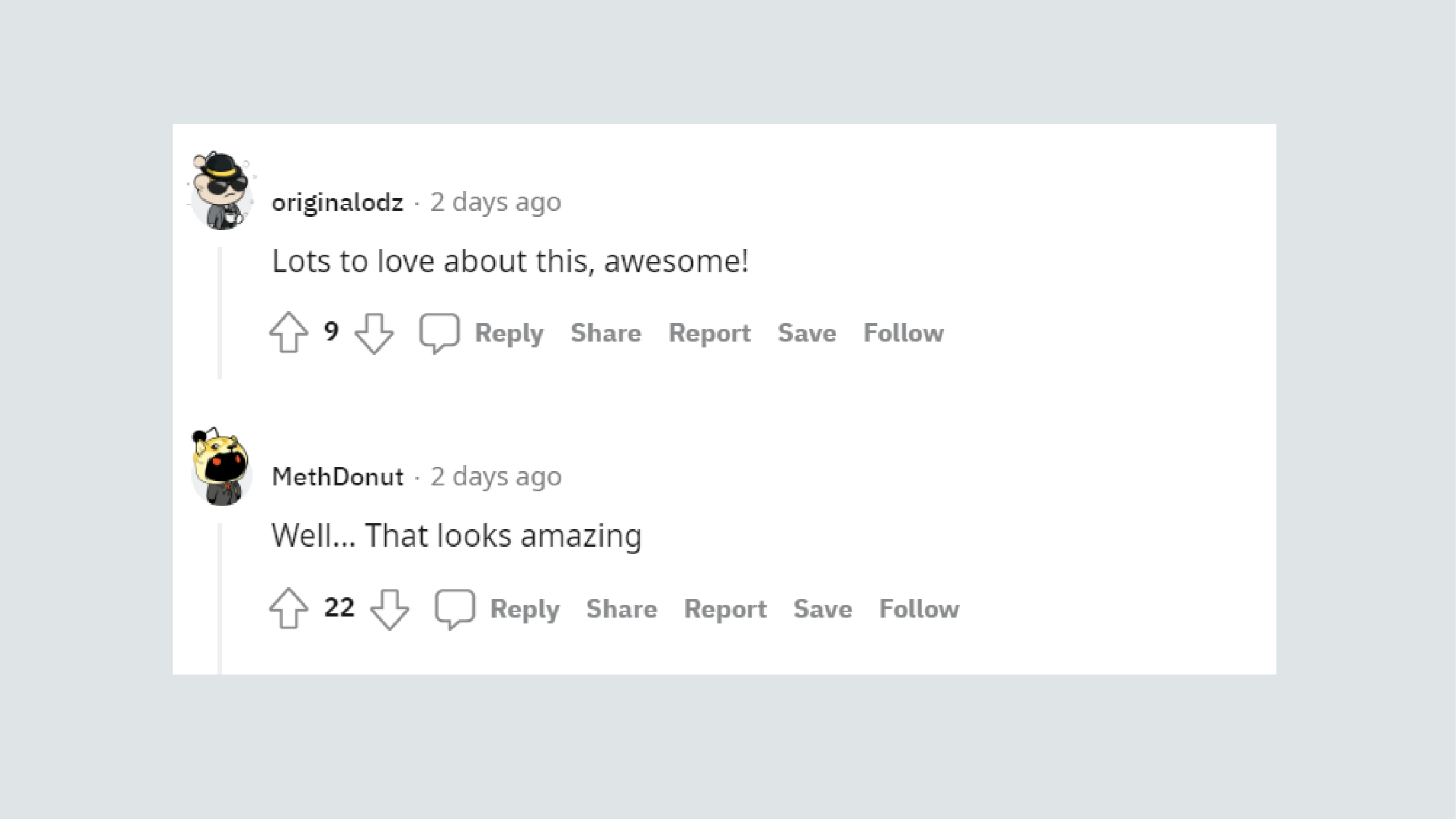
Portainer's value revolves around providing a simplified interface that's easy to navigate and allows businesses to adopt containerisation with less cognitive investment, so for our 2.15 release we focused predominantly on a highly requested UI overhaul.
As the sole UI/UX designer with Portainer, I first looked at addressing the low hanging fruit via design improvements that were possible with simple CSS changes. These included:
1. Better use of colour, fonts, spacing, icons, alignment etc - these helped make better use of space, created cleaner layouts, improved accessibility and created a sense that the product is deliberate and trustworthy.
2. Hierarchy - these improvements facilitated cleaner design and more focused UX by visually prioritising information based on its importance to the user, and helping steer them towards important or desired paths. For example, instead of 3 primary buttons all competing for attention in the same space, we introduced secondary and tertiary variants, and rules on their implementation - resulting in less clutter and more clarity for the user on how to perform important tasks.
3. Repetition and consistency - having multiple different design styles for similar components introduces unnecessary noise and essentially forces the user to relearn how to navigate every new page, which is disorientating. So in 2.15 we attempted to reign in rogue styling and keep everything more consistent. For example, instead of multiple different designs for box selectors, we reduced it to one component, which resulted in more consistent and therefore more intuitive UX.
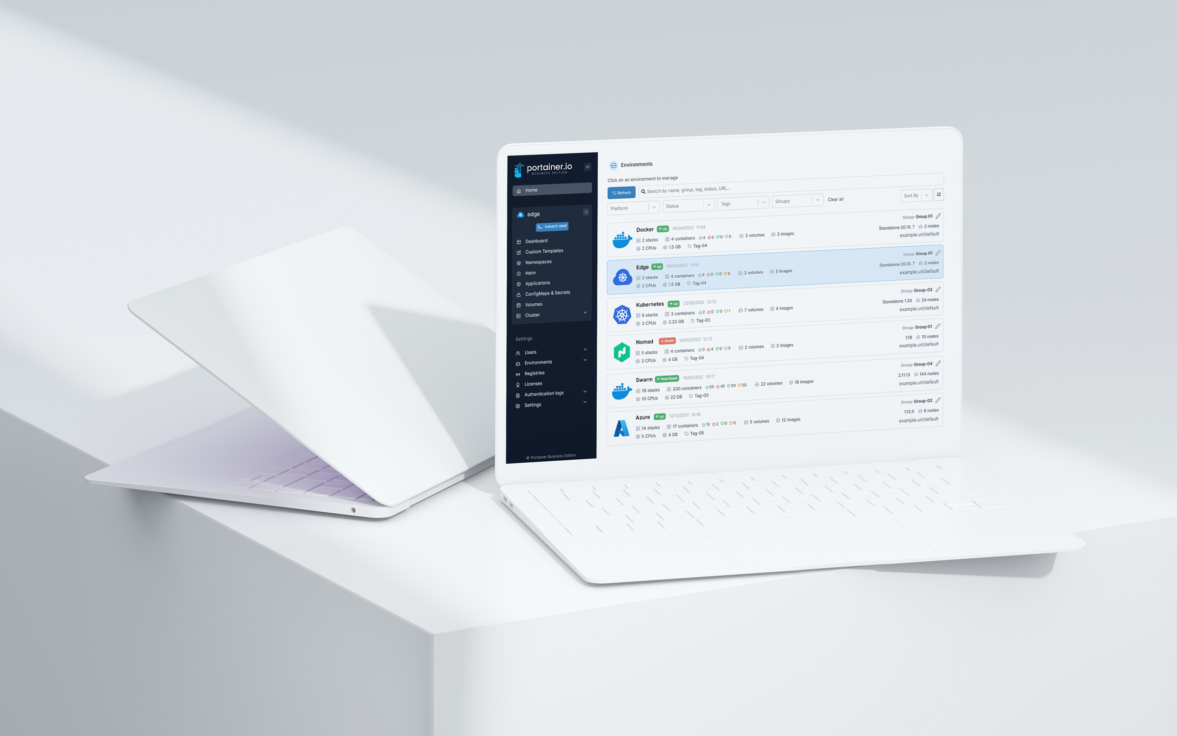
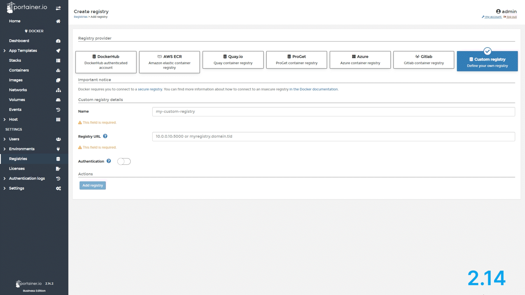
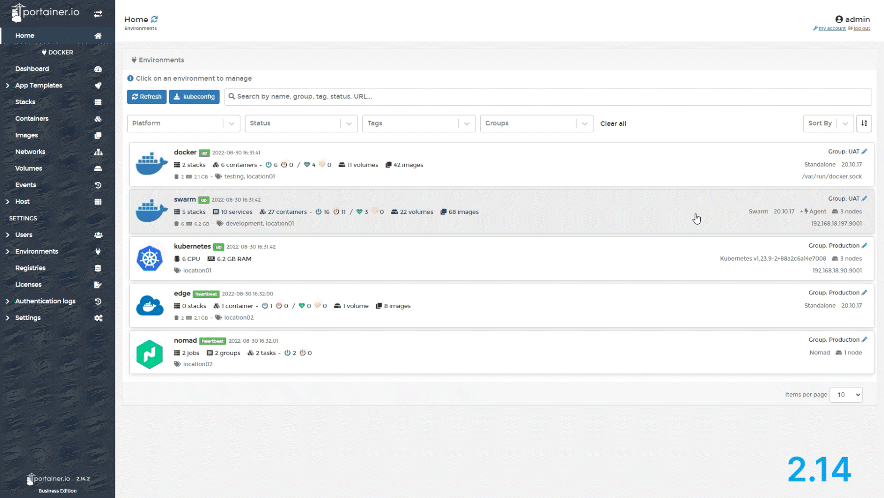
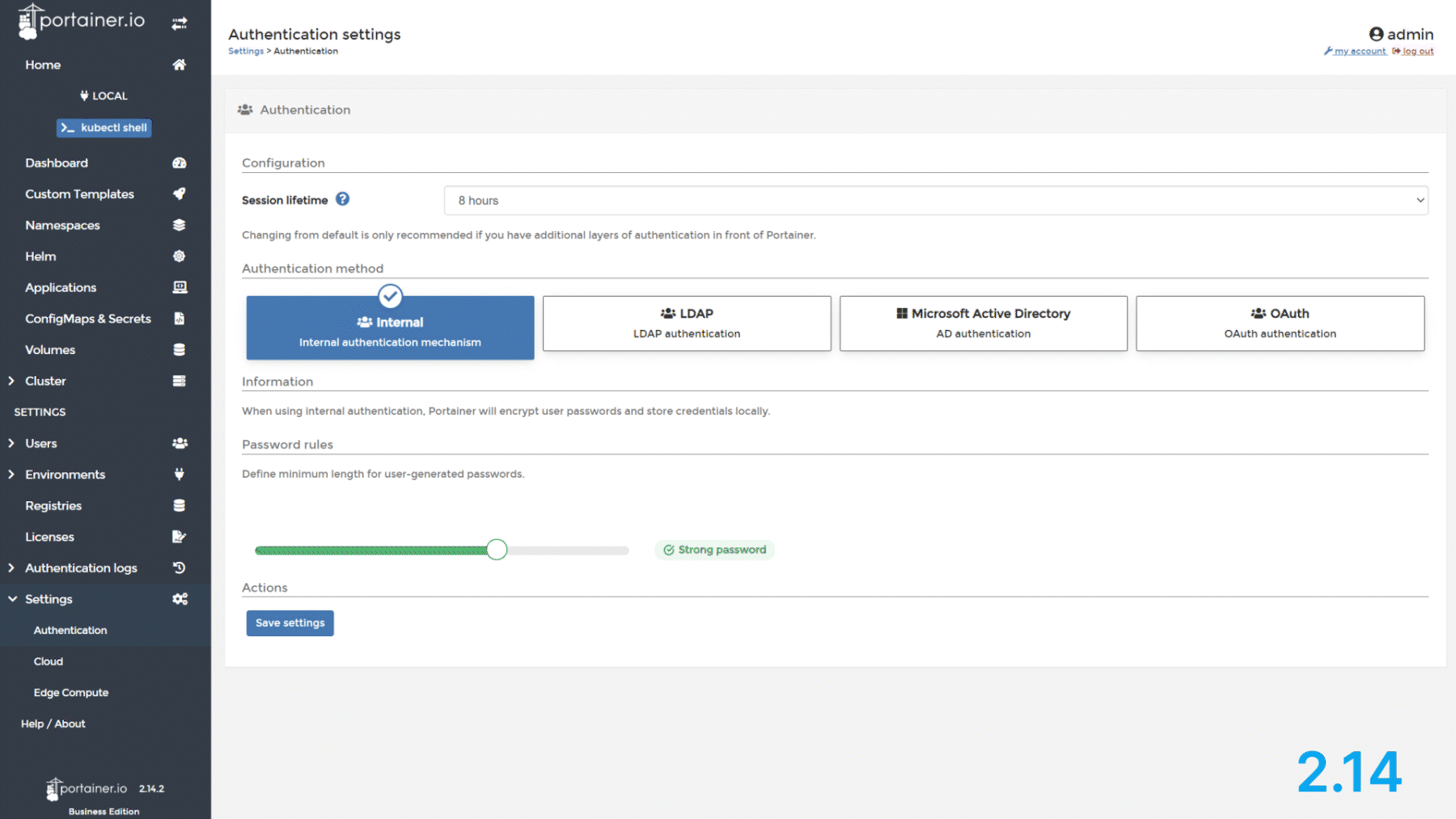
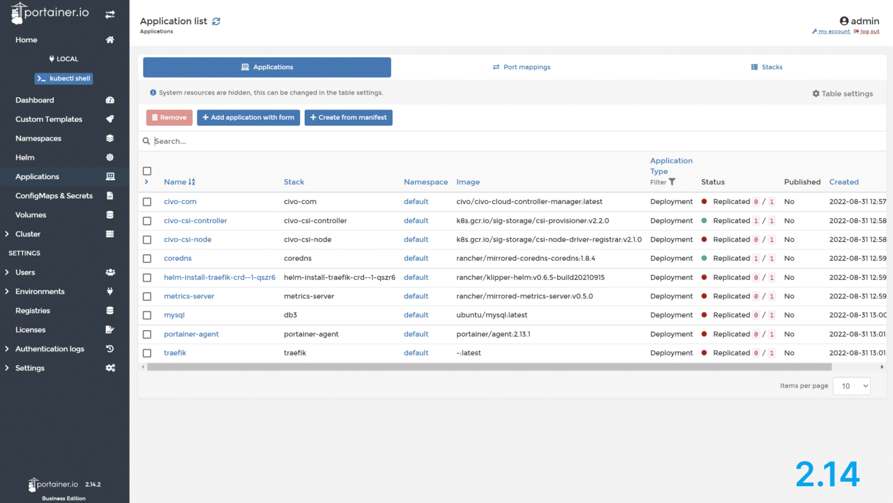
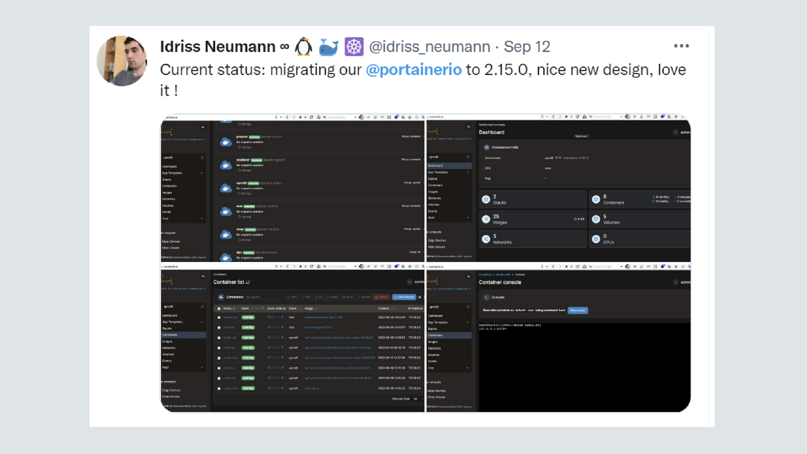
Below are some examples of the actual implemented interface before and after UI improvements:
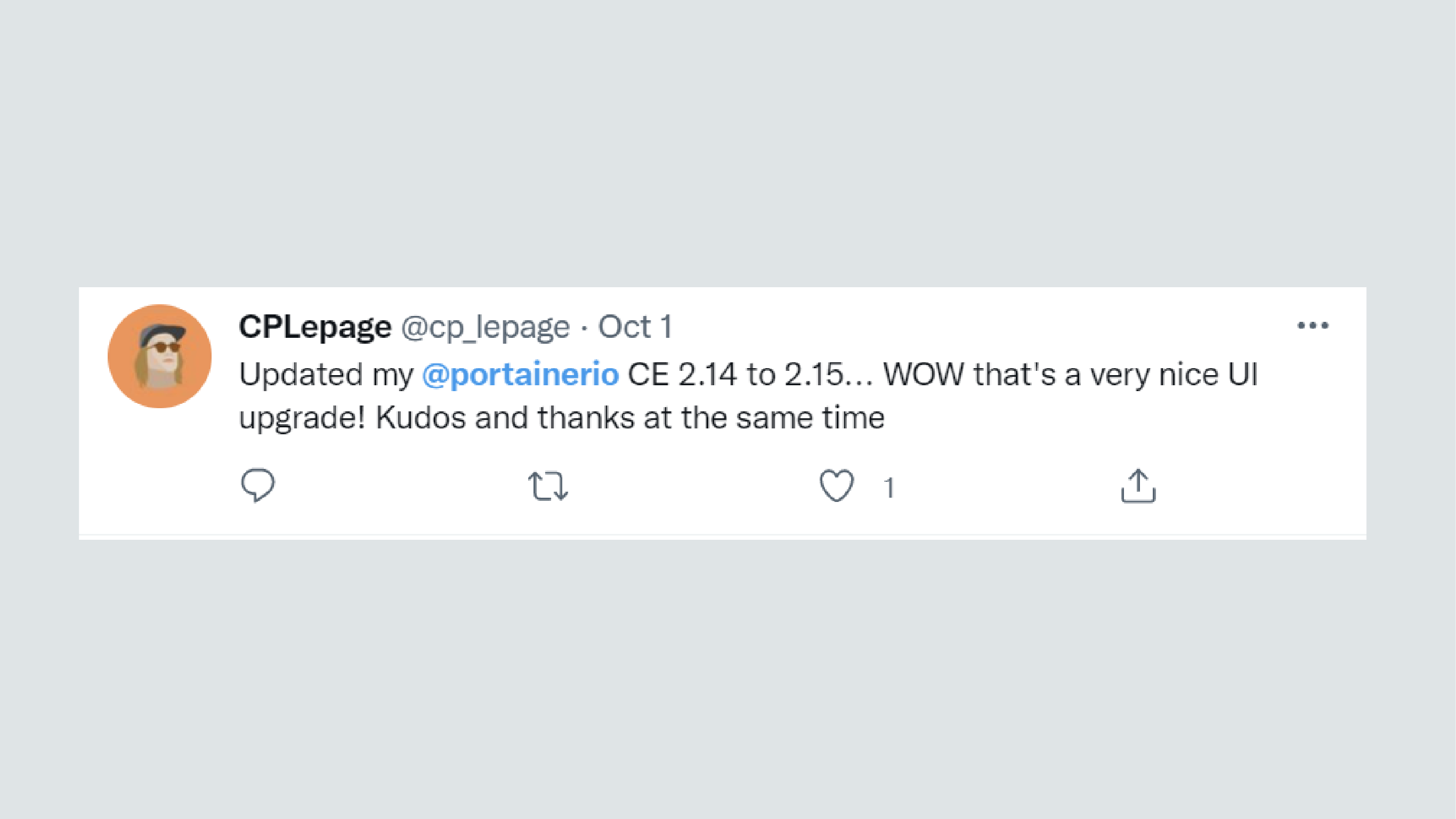
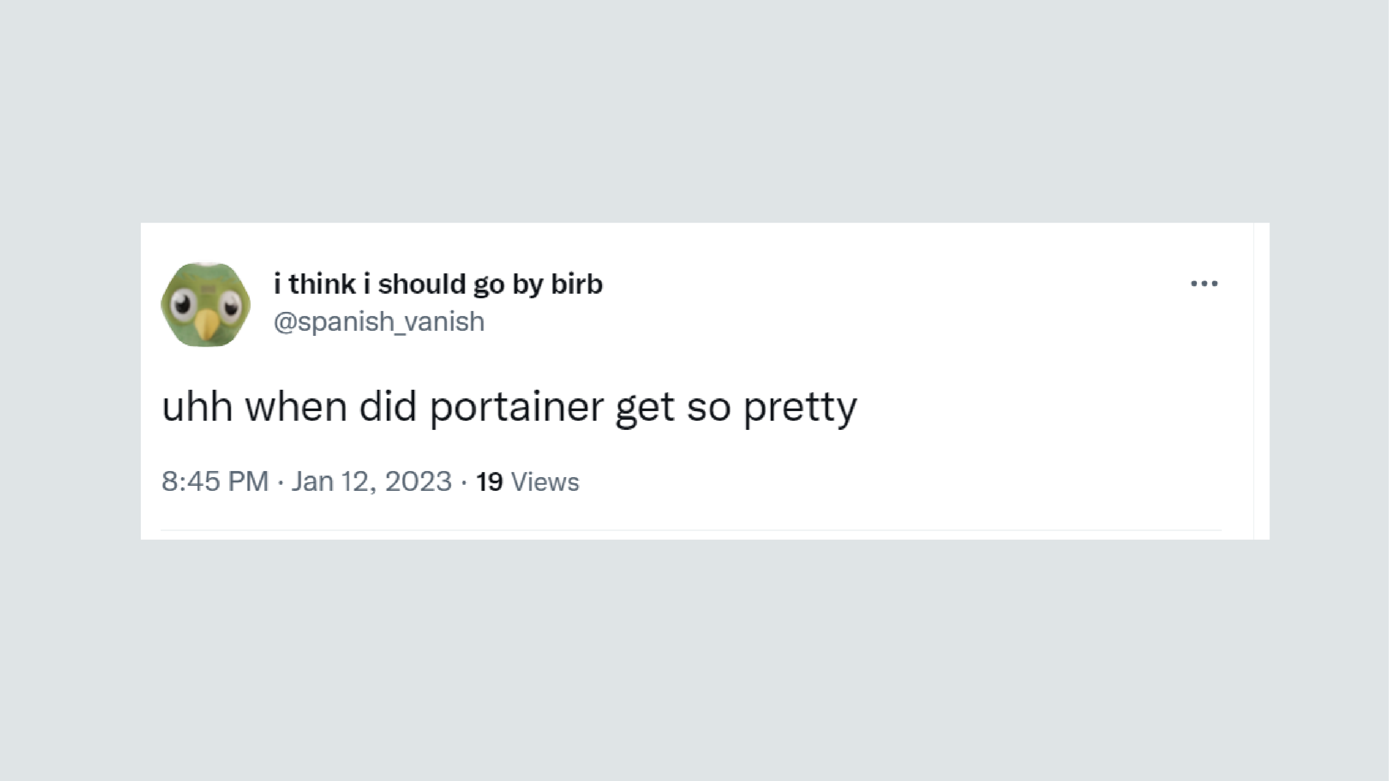
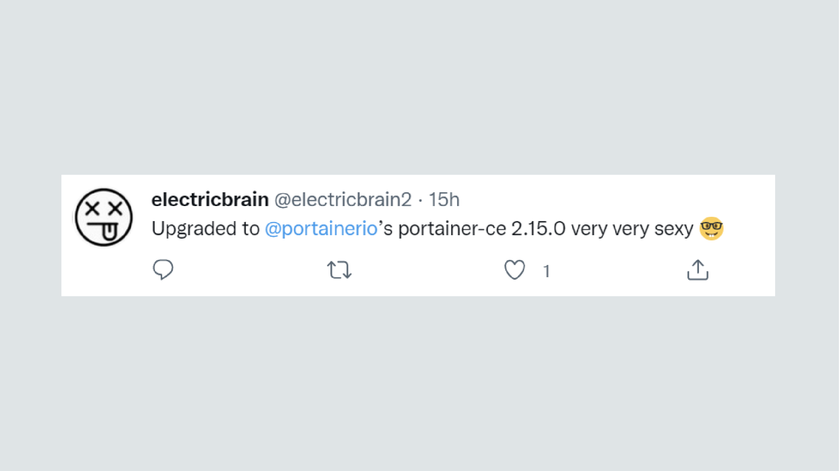
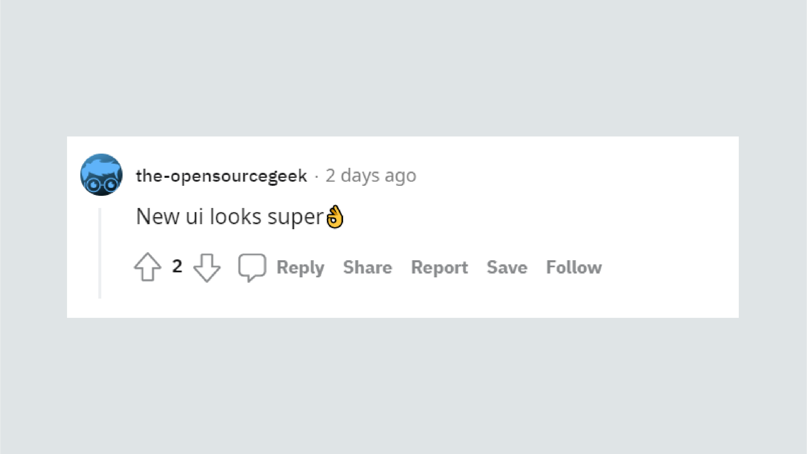
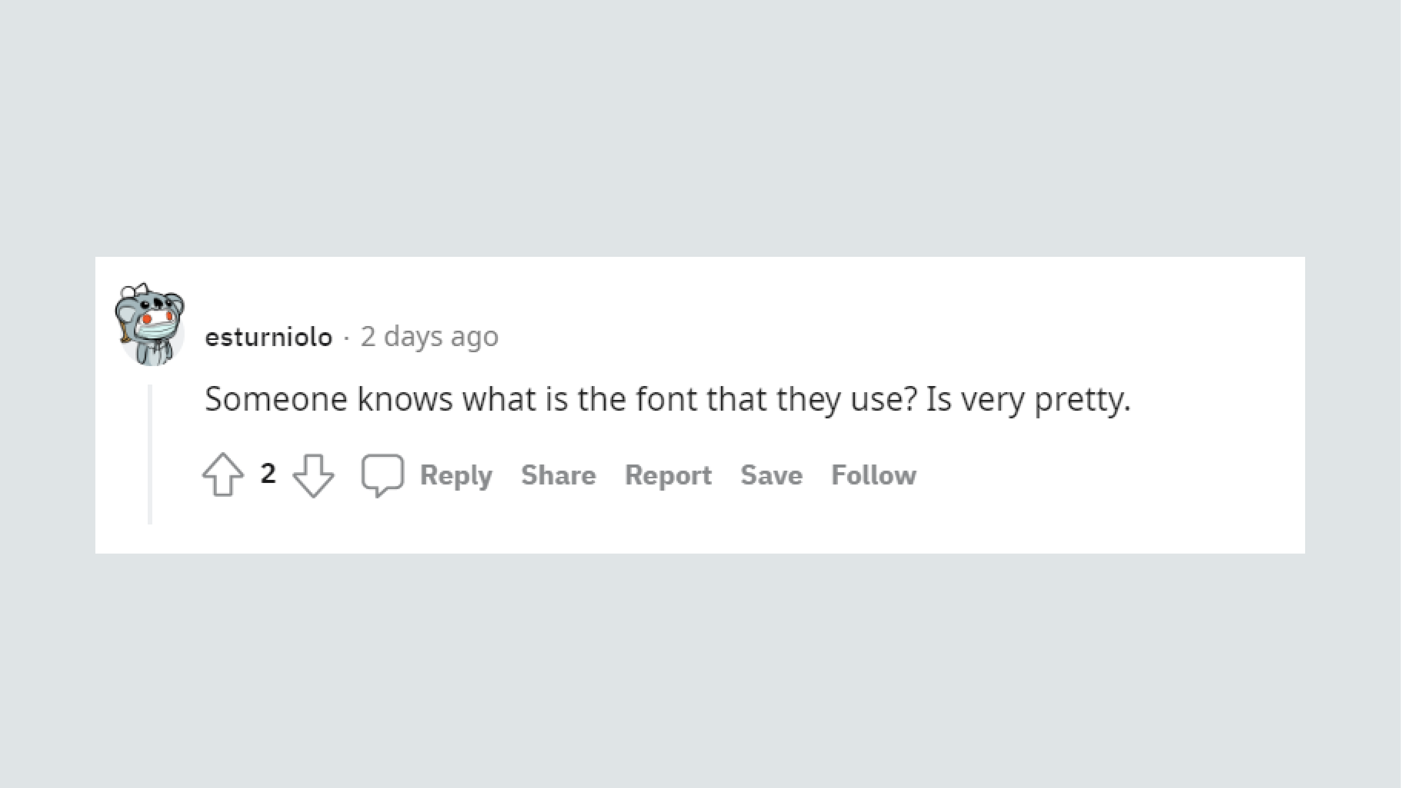
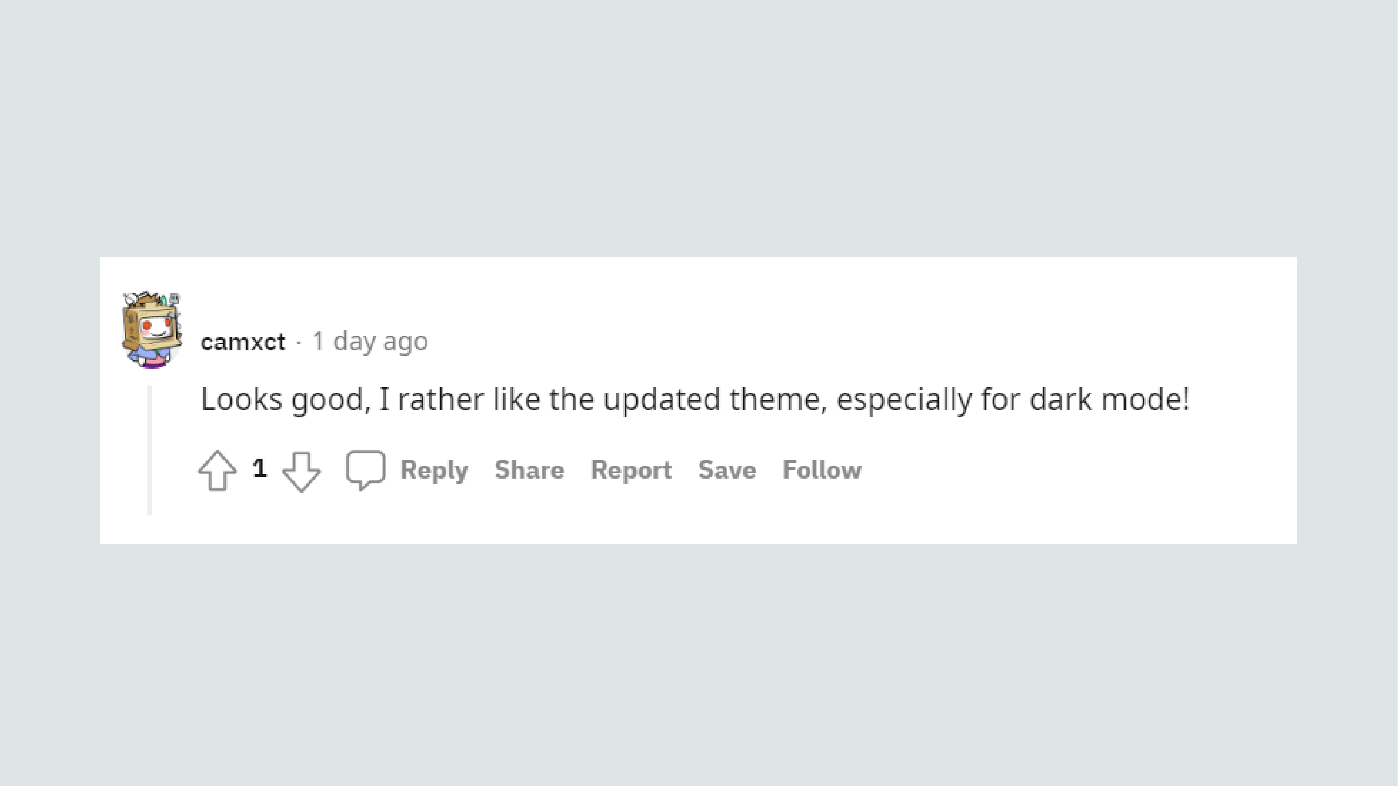
User feedback
One of the great things about having a community of users with no affiliation with the company, and no incentive to pull punches with feedback, is that you know their feedback is genuine. This made the customer response to our UI overhaul all the more heartening.

UX iteration
Throughout the product development cycle, I participated in continuous user research via user surveys and collaboration with our Customer Success and Product teams, as well as other key stakeholders. The insights gleaned from this research fed into the creation of new mockups and prototypes which assisted in further user testing and collaboration with the Development teams to implement new solutions.